START UP COMPANY BRANDING PACKAGE
All American General Construction Corp. 
Project Description:
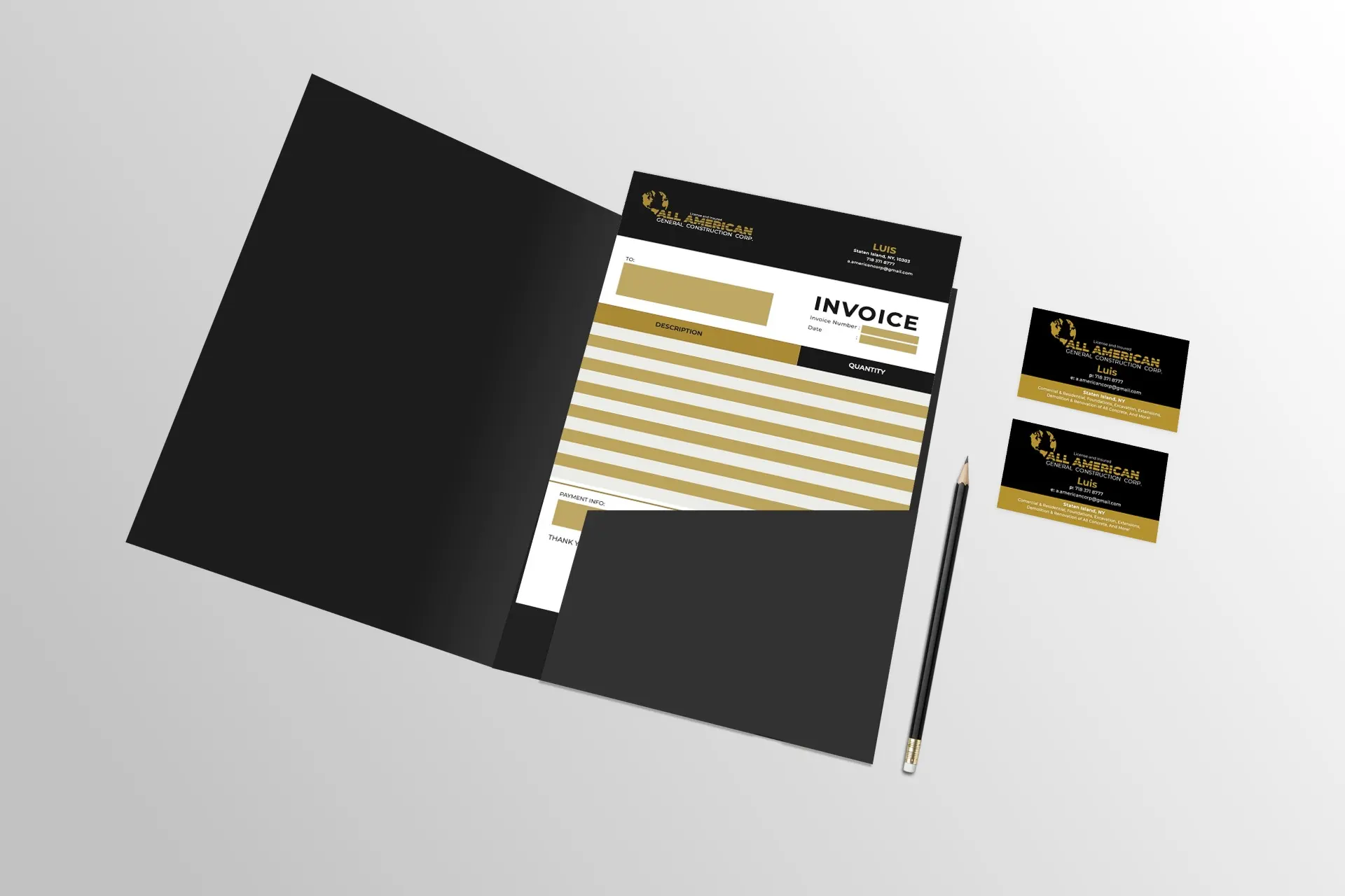
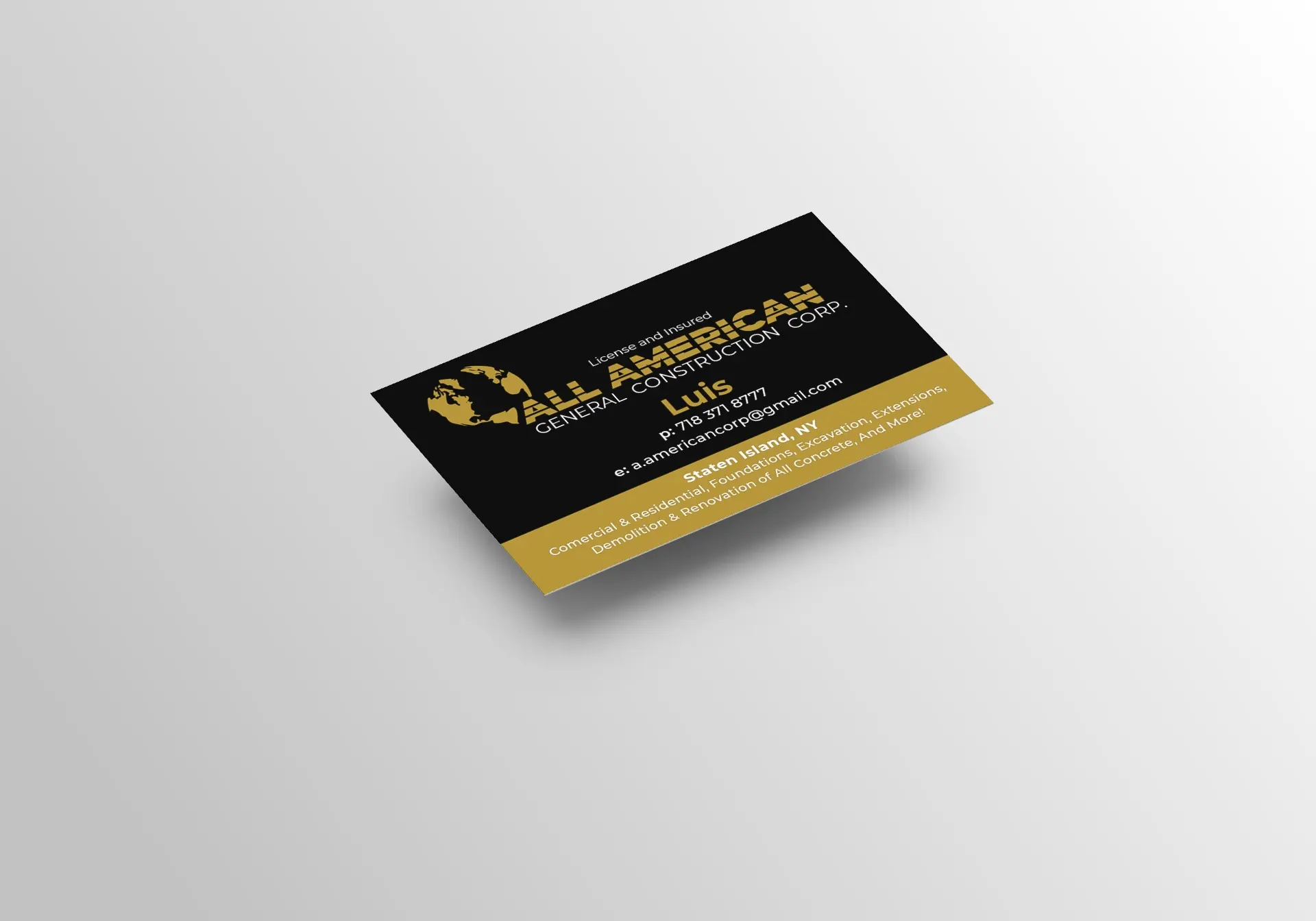
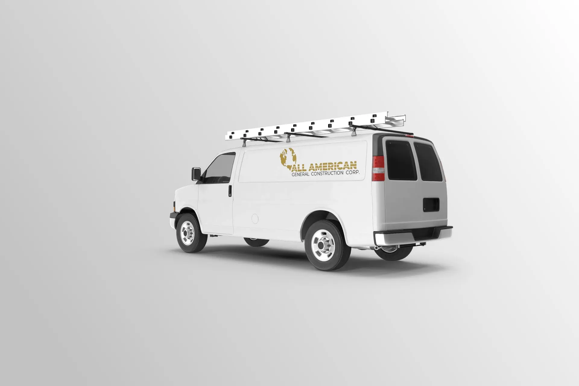
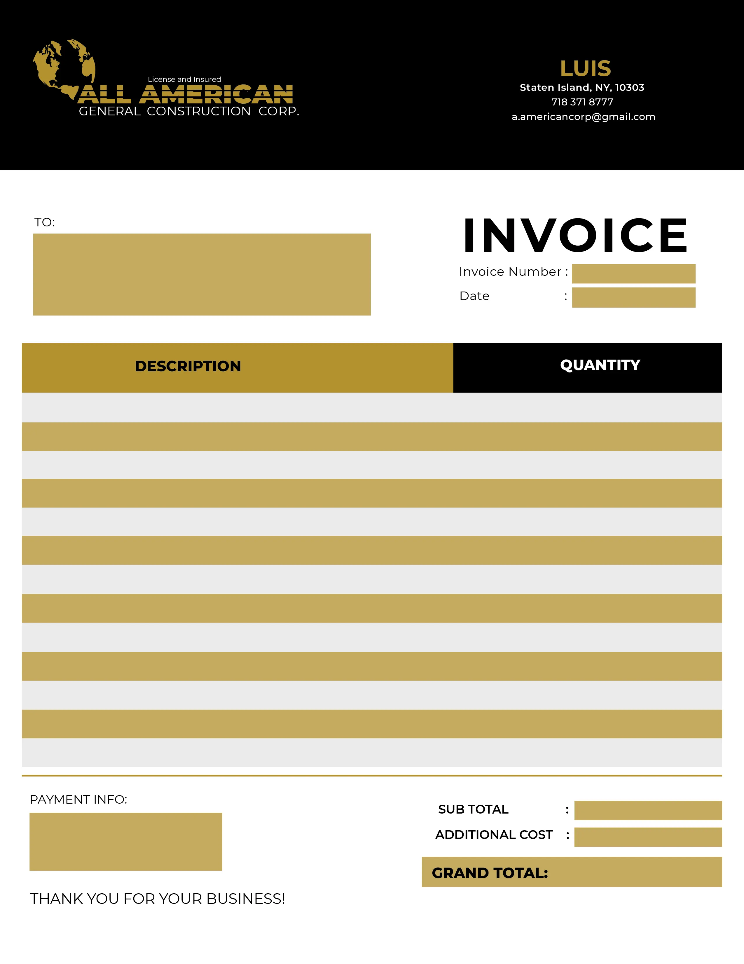
All American is a start-up general construction company. The thought process behind the logo came from the client. The clients specifically wanted a globe incorporated into his logo. To satisfy the client's exact demands, I alter the look of the logo using negative space rather than lines. With a few revisions, the logo was approved by the client. The typeface used in the logo is Montserrat Black, with some altercations to make it look like the stripes of the American flag which was another specific demand from the client. The gold color used in the branding is supposed to represent the color of the hard-hats that are used in construction.


