MAGAZINE SPREADS
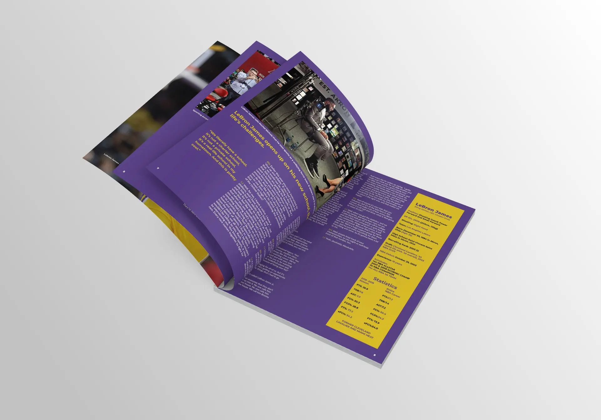
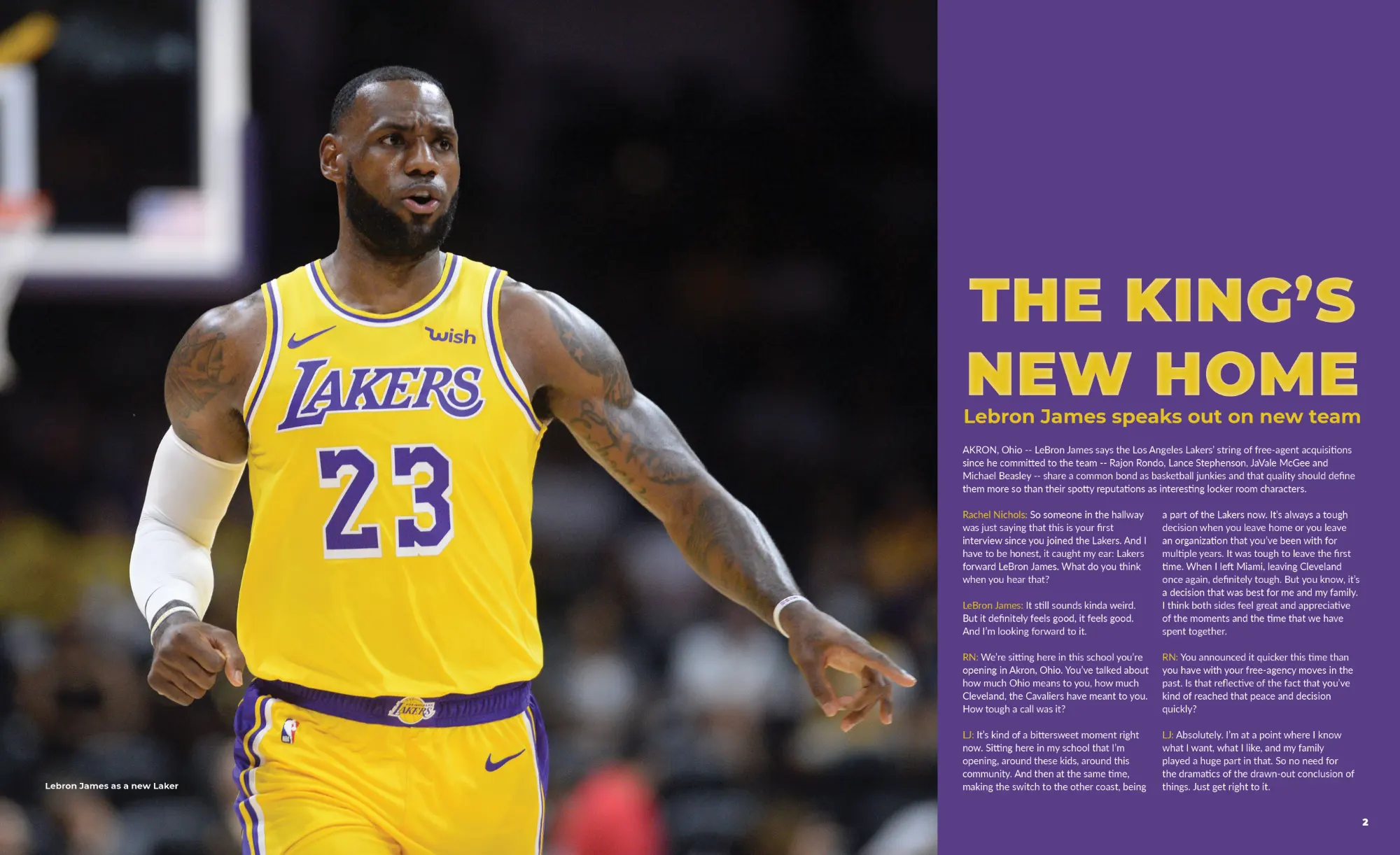
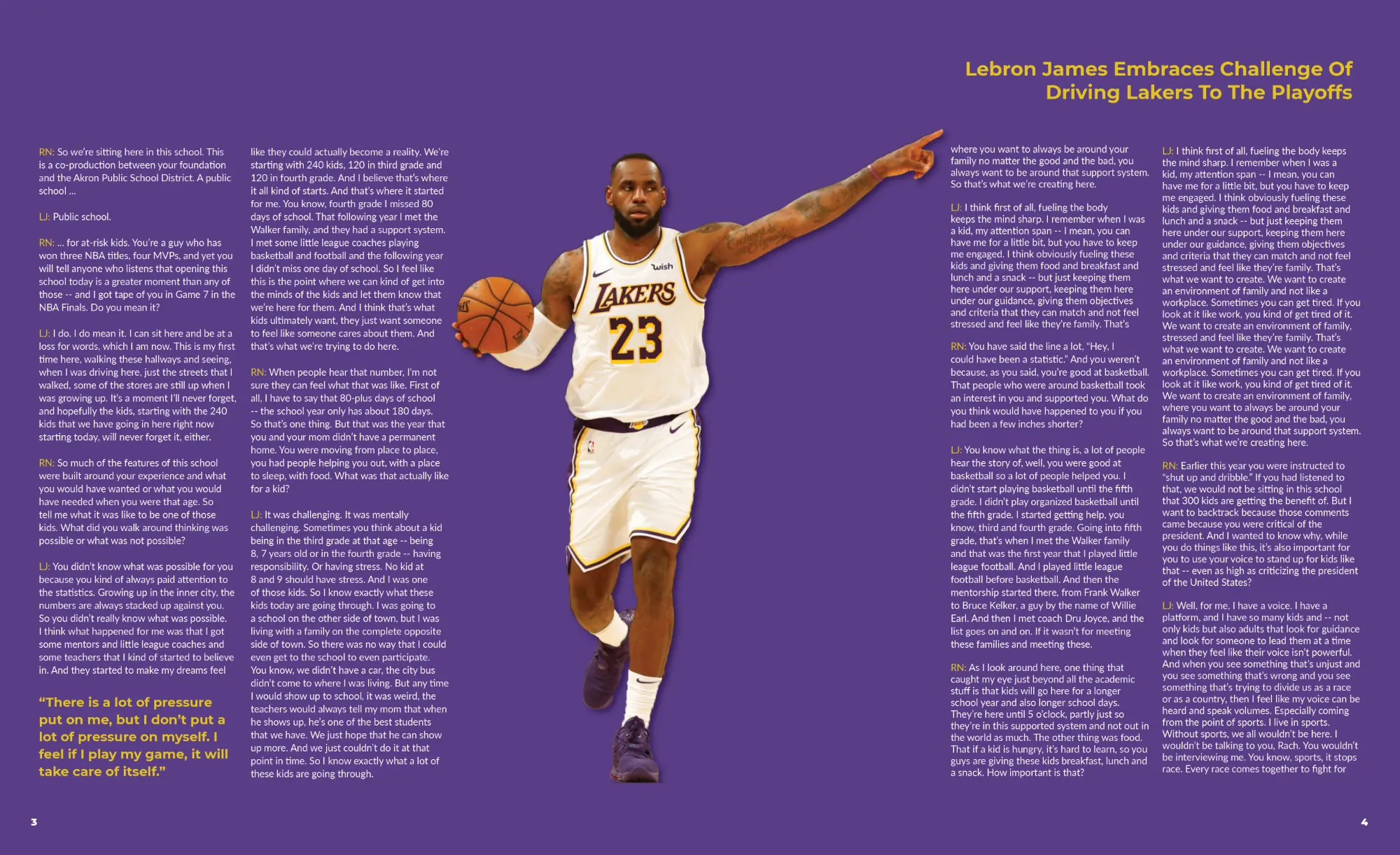
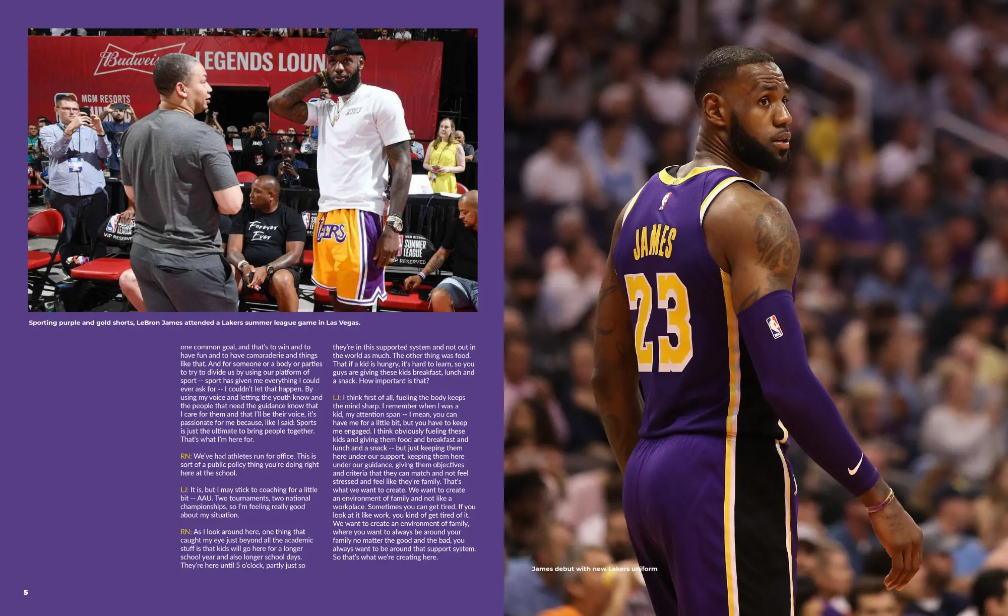
Magazine Layout Design on ESPN's interview with Lebron James
Project Description:
The thought process behind designing this spread was that I incorporated a two-column text layout on each page to neutralize the text-heavy transcript of ESPN's interview with Lebron James and to maintain balance into each page. Also, large and small images, a sidebar, and negative space alongside the san-serif typefaces that are Montserrat and Lato helped complement the overall aesthetic of this magazine article in addition to the color choice which was supposed represent the exact colors of the Los Angeles Lakers.


